
Computer Repair & IT Support in Barton upon Humber
Telephone: 01652 634851
Mobile: 07982 626 831
Email: info@asgardsys.co.uk
Mobile: 07982 626 831
Email: info@asgardsys.co.uk
Responsive Website Design
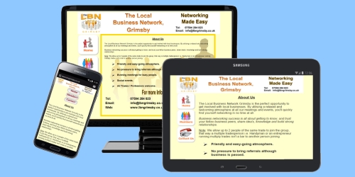
A responsive website design automatically adjusts its layout, images, and navigation to fit any screen size, from desktops to smartphones. For a small business, this is a necessity rather than a luxury. While a standard (fixed) website might look great on a computer, it often becomes difficult to use on a phone, forcing users to "pinch and zoom" to read text or click buttons.
Responsive design ensures your NAP data (Name, Address, Phone) is always easy to find, which is crucial for local customers on the go. It also boosts your Google ranking, as search engines penalise sites that aren't mobile-friendly. Essentially, a standard site is built for a screen; a responsive site is built for the customer's experience.